The website I created for the HOLGA film camera is meant look like a collage with many pasted elements. I decided to take a different approach with the design for this project compared to project 1. I am using photographs instead of illustrations since I am showcasing a camera. I felt that I was able to properly portray the feeling I was trying to evoke with the styling of the photographs, typography and colors I chose.As far as the design of the page I am quite pleased. However I still think I can do more to improve the functionality of the website. I believe that it would benefit greatly from a couple more interactions to make it more interesting to the audience.
Project 2 – Refined Design
Project Two Reflection & Link
Project Two. Minus a few weeks wasted on a direction that was bland and boring, I was really happy with what I was able to accomplish with the second project. I redid the concept and drew everything and got as much coding as I could in a week. If I had more time, or just more motivation to work on it out of school, I think it would develop into a really fun and creative site. I could definitely see myself pulling the characters and concept into a children’s book or something along those lines.
In terms of coding, although its mostly duct taped together, I figured out placement more than I had on any site before. I also used some interactive features like scale and rotate. I tired some other things, but it either broke everything else or did absolutely nothing at all. I would’ve loved to have more done on this site, but I am so slow to code. I found thinking & designing for web a real challenge, mainly because I felt intimated. Im happy that I took this class, though. Anyways, the site wasn’t that amazing, but I am proud of it none-the-less.
If you are looking at the site, be warned, I designed it to a specific size to get everything in place…It may need so adjusting.
Project 2 Self Evaluation
For project 2 I think I accomplished what I wanted to do. I wanted to make a functioning website that resembled a site that I would actually purchase something on. There were a few extra effects I would have liked to work into the site but I still have trouble figuring out what everything means on jQuery.
Now that I’m done with the site I’m not in love with the whole aesthetic of the site, I feel like the home page doesn’t fit in as well with the other pages. I like the fading effect, the dark to light effect, but I don’t like the overall design of it. I feel like it clashes with the other pages.
Overall I think I did a good job making a functioning webpage and I think it would pass as a page someone would actually buy a product on.
Project 2 Self Evaluation
Initially, my design comps showed a divided scrolling action happening on the gallery page, but I couldn’t get the scrolling to work without sacrificing the other jQuery functions. My solution for that page ended up being the sliding effect with color filters. I wanted the labels to not say “Before/After,” but rather something about the image/camera that took the photo. However, to modify that, I had to go into the SASS document that was provided and I couldn’t disperse the parts of SASS. I left it alone so as not to break the jQuery.
With this project, I felt a little more comfortable with modifying and writing jQuery, but yet not enough that I was able to make everything fit the product exactly. Looking back, it seems counter-intuitive to have a separate home page when it could just scroll down. I think the user experience could have been better and easier to navigate, but I focused on getting the interactions to work and better understanding jQuery with the design I had come up with.
The 360 degree images took the longest to figure out because all the cameras would revert back to the same image at one point. However, it worked out in the end. The animation that occurs in the Lomography type on the homepage could also be incorporated elsewhere, such as in the patterns on the gallery page. There could also be some cleanup such as fixing positioning and headers.
Overall, I was pleased with what I was able to accomplish for interactions, but I do think the site could do with a more finessed design.
link to my site and self evaluation
http://web.pdx.edu/~trace/Art342_Sp015/Art_proj2workingfiles/#firstpage
for this project the product I wanted to represent Copic markers. I chose this particular product because I enjoy the materiality of drawing and non digital mediums. Not as a end to themselves or finished pieces but non digital mediums are a vital link to my process what ever the project. My questions that i tried to answer during the research phase was how to best represent the materiality of the markers. I was looking at weather to be illustration based, color based, or product photography centric concerning the products representation. i chose the main theme of the site to be centered around color. I chose and constructed color themes around the companies large pallet. and tried to represent that pallet in my site. for the typography aspect of the design I wanted a humanist san serif I thought that this was appropriate based on the premise that humanist type-faces are based on calligraphy. I believe that reference to hand-writing was fitting considering the product. The final type I chose after my type studies was Freight-Sans-Pro I believed it bo be an attractive friendly, and appropriate choice. Only thing I didn’t like about it is that the numerals are non-lining,so that made a couple of weird instances that I didn’t like and still need to find solutions for. i do like the progress of my site. I was just disappointed that my interactions work out in time for the presentation.working this on this site was less chaotic than my first project. I felt my process was much more organized. Though I did like the intuitive nature of discovery that my first website allowed, I do find more enjoyment from a consistent thoughtful process.
My Final Site! Project #2
http://web.pdx.edu/~jakouka/ART%20342/popsnap/
This is Popsnap! A site meant to mimic the feel of opening an unexpected package. This always follows the process of finding the box, opening it up, popping the bubble wrap (of course, and finally finding out what’s inside.
The site is relatively responsive, though the media queries were all handled by plug-ins. Links at the bottom will send you off to purchase an item you found!
Thanks for checking it out!
Jordan
Final Site!
not 100% happy about it but here is my final website!

Self Evaluation and Final Project
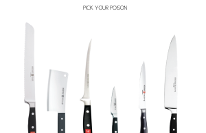
http://web.pdx.edu/~twojahn/342/Knives/index.html
(click the CHEF’S knife, *far right*)
Even though this project was one of the most challenging for me, and even though it really didn’t turn out how I planned, I’m really proud of it. Not because it looks or works amazingly, but because I feel like I really did trouble shoot the majority of it on my own.
The biggest bummer for me is the fact that it’s incredible UNresponsive. in fact, it’s the antithesis of responsive. The browser needs to be sized to the exact width of the page, or it will be off. (pro-tip, use the image at the bottom as a reference for the width of the browser.)
The other big issue I had was triggering animations. I really had no way of doing that because I couldn’t get waypoint to work. So 90% of the animations are only triggered by the page loading.
I’m most proud of the final “cutting” transition. I looked for a plug-in for a while before just deciding to figure it out on my own. And I did! It took a super long time, and I wish I had more of it, but I was able to do exactly what I had envisioned, and I think it looks good.
For the most part though, I think the overall vibe and aesthetic are pretty darn successful.
CSS Framework Practice/P2 Self Reflection/P2 DeLorean

http://web.pdx.edu/~prosales/342/delorean/index.html
CSS Framework Practice

http://web.pdx.edu/~prosales/342/cssframework/index.html
P2 Self Reflection
Project two was challenging for me because of the product I chose to create my site about. I think I had a hard time wrapping my mind around how to communicate the concept of the DeLorean time machine in a way that looked like this car could be a real thing. If I had to do it over again I would have chosen a product that I could was more straight forward and therefore I could focus my efforts on explaining how it works and other essentials to the site. Live and learn I suppose.
I found the voice over of Doc Brown to be humorous and reminded me for a moment that making this site could be fun and playful as well. I wasn’t sure how to do this at the time but I figured it out and will take that as a small victory during the building of this site. I also like the imagery I choose to put in the site I felt it worked really well in showing off this amazing vehicle. The photo gallery I used I felt worked to show a lot of pictures if someone were into that sort of thing.
If I had more time I would have found a better way to explain how the car worked. I would use some different plugins or animations perhaps to make that experience better for the user. My type and color choice seemed appropriate at the time but I might try to take a few more chances next time. Overall I’m okay with what transpired and will learn from this going forward.

You must be logged in to post a comment.