Still have a long way to go…
Still have a long way to go…

I’m behind on my HTML and CSS, but I’m not too worried about that. I’m more worried about using SVGs and all the jQuery I’ll need to make this come to life. Though there isn’t much to see, you can track my progress here.
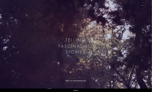
For those of you all working on parallax/editorial site this is great for inspiration: The Maine Thing Quarterly
Some—hopefully useful—js pulg-ins not talked about in class:
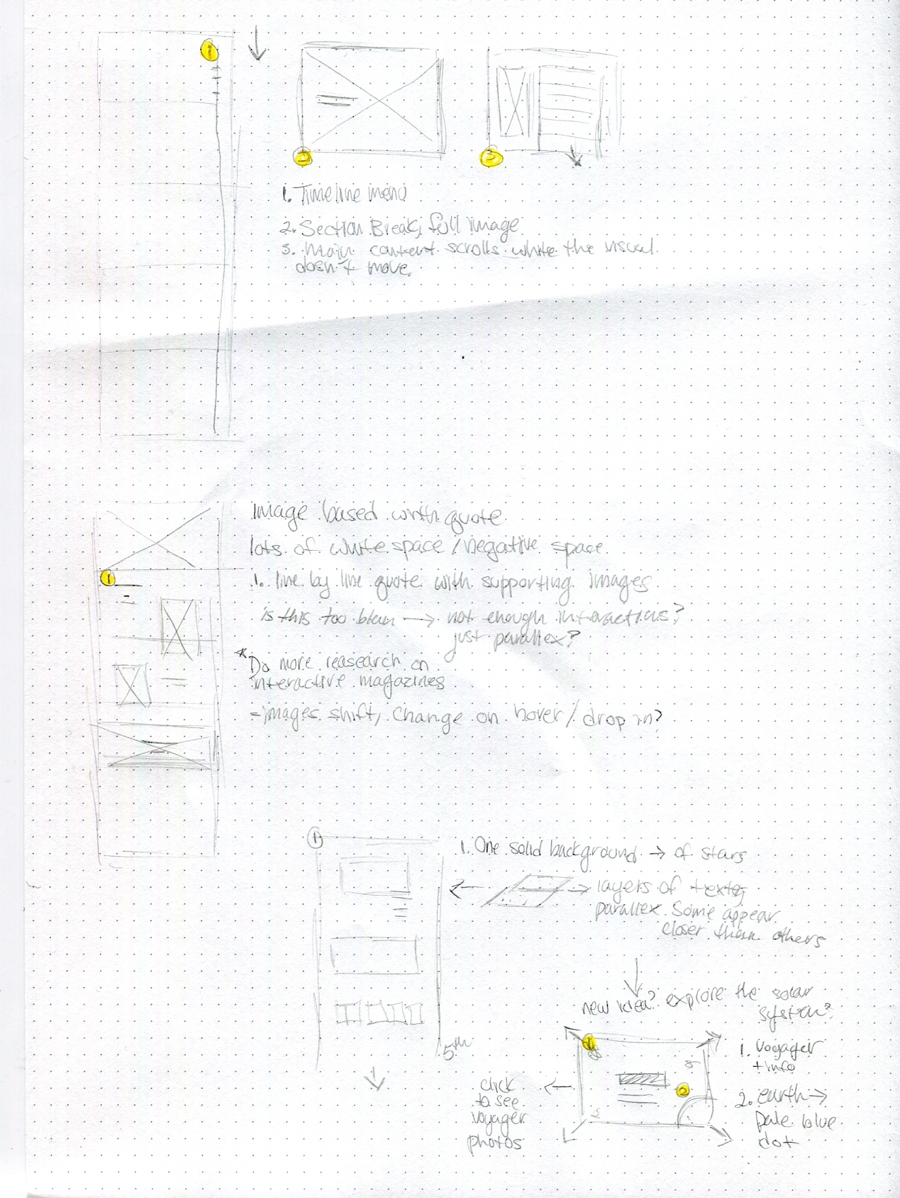
My comps are still very very rough and I’m feeling behind. This is all I have for now:


I don’t think I need so much content. Just snippets of information which as a whole will give you the big picture might work better. Maybe sketching a site map would be helpful for me to better structure my story? I feel a bit all over the place.
set 1:

set 2: these are not my illustrations, I’d make my own that you can click through.


set 3: Similar to the first set, but I want more negative space and asymmetry.

Okay, so I’m still struggling with my topic, so I roughed out a backup idea and will need to make a decision today.
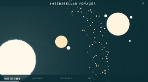
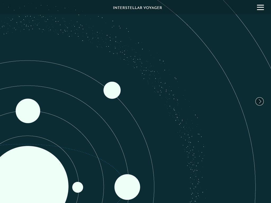
Idea #1 Editorial inspired layout that tells the story of the voyager mission. Lots of photos and typography.
Idea #2 A fun little website illustrating a house with the goal to find all the cats hidden throughout and fun clickable objects with facts about cat care, or something like that. It clearly needs to be thought out a little more if I chose to go with it.


Website Research and Analysis
The Good
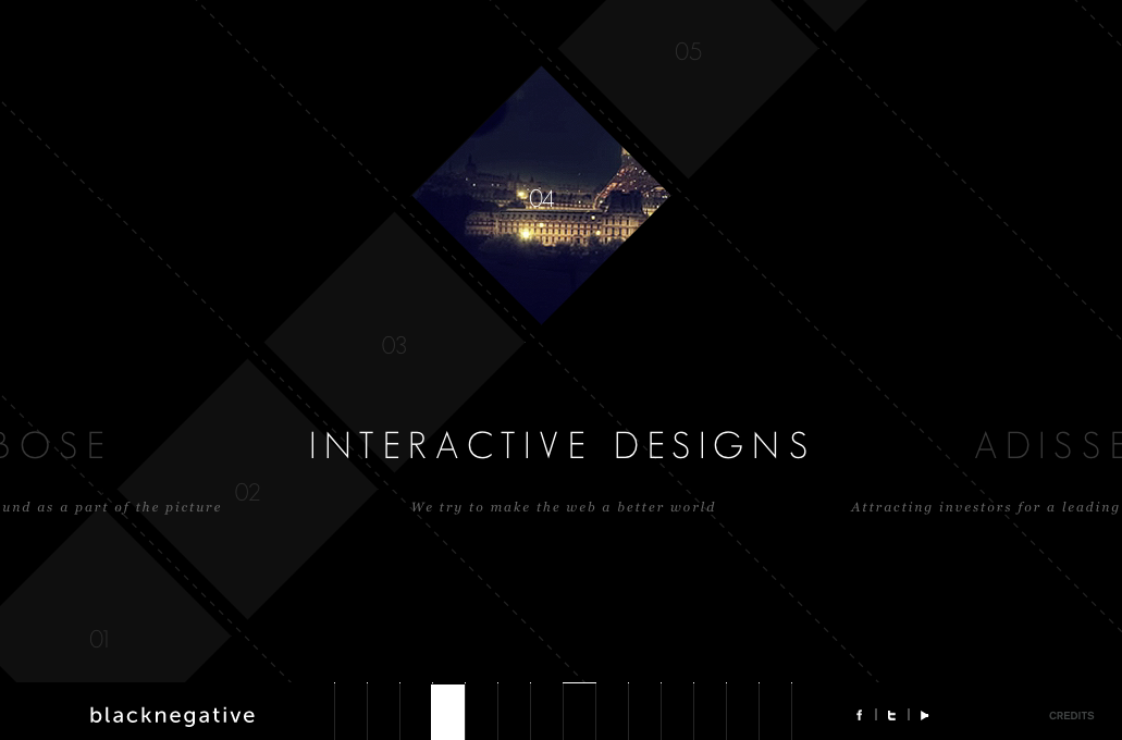
The Bad

This is a beautiful website, but trying to actually interact with it, there are some flaws.
And CSS Diner, which was cute and informative:

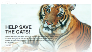
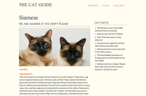
At first I tried using Pure, but it made my letter spacing super condensed for some reason, so I switched to Bootstrap. I moved on from house cats to big cats!
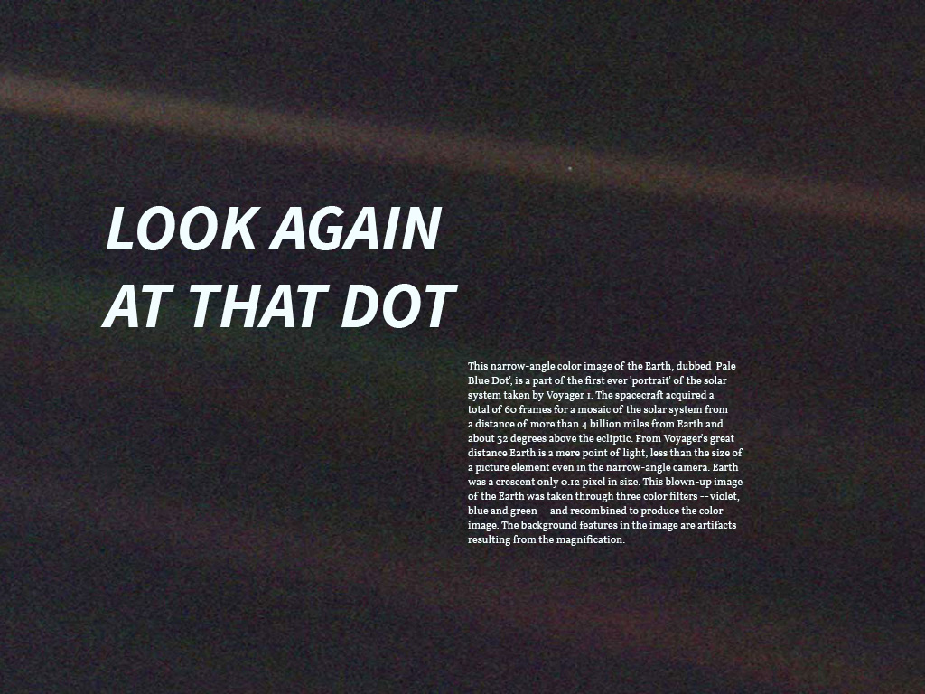
For Project 1, I’m stuck. I am inspired by the editorial example Thom showed us, but I’m not sure what my content would be. I was thinking about using Carl Sagan’s Pale Blue Dot quote, but I feel like I would need more content or context for it to work as a narrative website, but I don’t know what this should be.
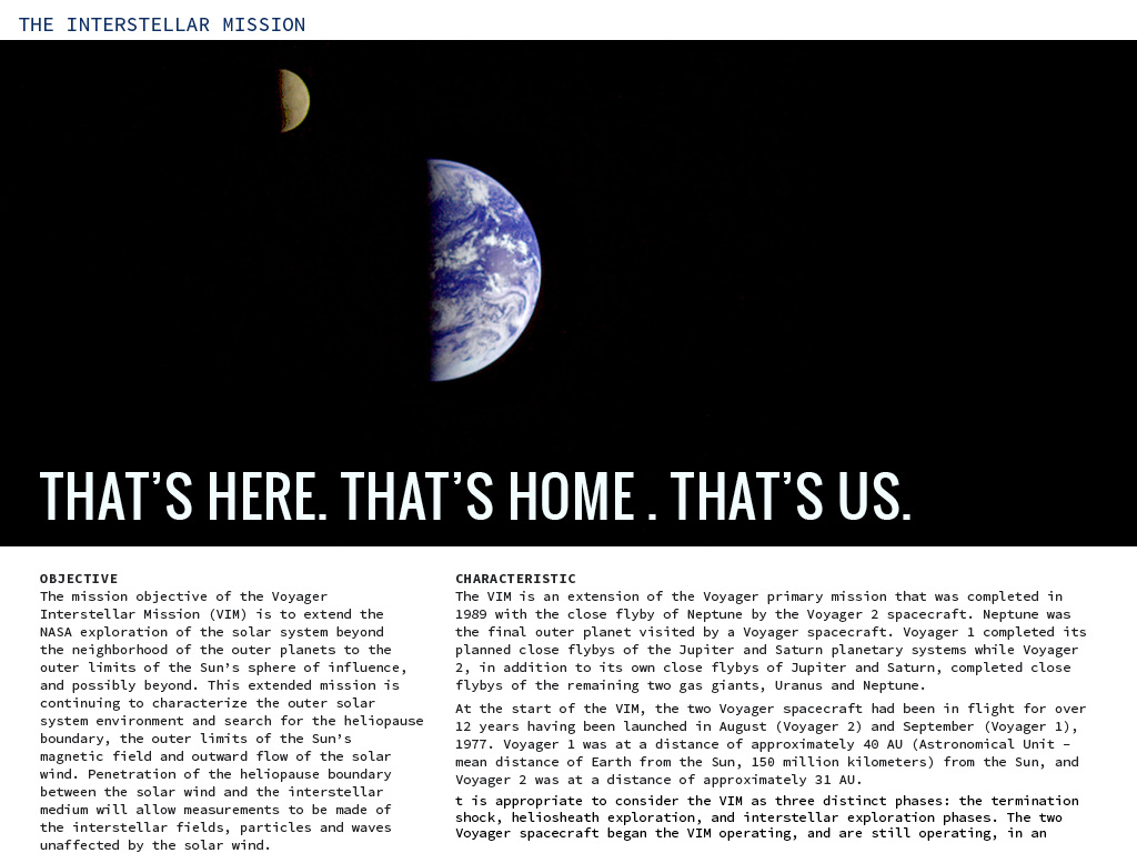
One possibility that I came up with would be to also talk about the history/timeline of the Voyager. NASA has a lot of information on their site about it. Another route would be to create a timeline of Carl Sagan to coincide with his quote.
Here’s my little site:
Hover over the site title and subheader to see some minor changes, plus the paragraphs are collapsable.

You must be logged in to post a comment.