Website Research and Analysis
The Good
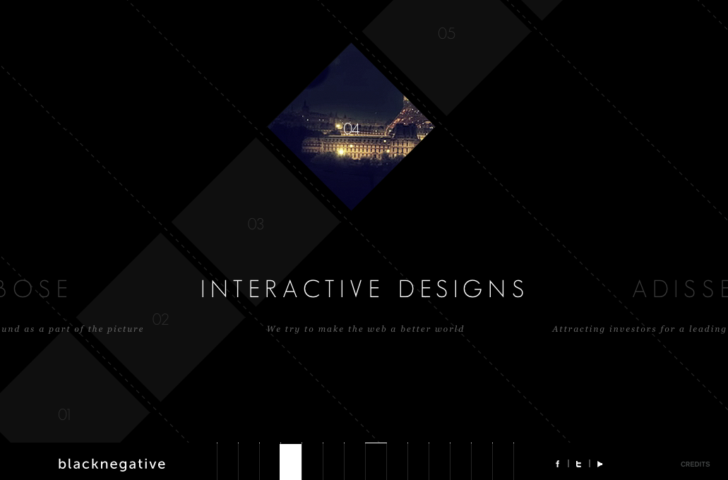
- Every “page” is slightly different with something to click, hover, and interact with making the site fun to explore.
- Some of the interactions aren’t as intuitive/standard as other site (for example, you have to click and drag between pages) but they used a custom cursor which helps guide you so you always know how to naviagte the site.
- The menu at the bottom is lovely and unexpected and makes it easy to quickly get an overview of the site or jump to a certain page.
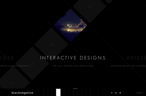
- Each page has a sense of depth and layers as things move and overlap.
- This site doesn’t just move from side to side between pages, but it’s nice that when you click within a project the page shifts up rather, changing the flow slightly.
The Bad

This is a beautiful website, but trying to actually interact with it, there are some flaws.
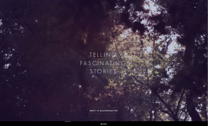
- There is no menu, so if you wanted to find a certain section you have to scroll around for it.
- It can be easy to miss the divide between sections if you’re scrolling quickly.
- There is nothing to actually click on (with the exception of a some of videos), but some places look like there are buttons, such as the first “page” with the down arrow.
- Maybe it’s the way I scroll (I have a tendency to scroll around quickly) but for this site to flow properly I feel like I need to scroll so slowly.
- If you like using arrow keys, then it feels too slow in some sections, at least for me.
And CSS Diner, which was cute and informative:

